Visualizing and Analyzing Human Activity Patterns through Graph-Based Methods
DOI: https://doi.org/10.1145/3696271.3696310
MLMI 2024: 2024 The 7th International Conference on Machine Learning and Machine Intelligence (MLMI), Osaka, Japan, August 2024
In recent years, the proliferation of wearable sensors and mobile devices has enabled the collection of large-scale spatiotemporal data, providing unprecedented opportunities to analyze human activity patterns. This study presents a novel approach to visualize and analyze human activity patterns using graph-based methods. Utilizing a dataset comprising timestamped geographical coordinates and labeled activity data, we construct a graph where nodes represent individual data points, and edges denote temporal proximity. By employing Graph Neural Networks (GNNs), we effectively capture the intricate spatiotemporal relationships inherent in the data. Later, we compared three other models GCN, GAN, and GraphSAGE, and found that GCN performs better for cluster separation and GAT shows best in terms of training loss.
ACM Reference Format:
Saima Ahmed Rahin, Bo Hui and Wanwan Li∗. 2024. Visualizing and Analyzing Human Activity Patterns through Graph-Based Methods. In 2024 The 7th International Conference on Machine Learning and Machine Intelligence MLMI) (MLMI 2024), August 02-04, 2024, Osaka, Japan. ACM, New York, NY, USA, 23 Pages. https://doi.org/10.1145/3696271.3696310
1 INTRODUCTION
The advent of wearable sensors and mobile devices has revolutionized the way we collect and analyze human activity data. These technologies have enabled continuous and pervasive monitoring of individual behaviors, providing rich datasets that capture spatiotemporal dynamics of daily activities. Understanding human activity patterns is crucial for various applications, including urban planning, healthcare, and personalized services [1], [2]. Traditional methods for analyzing human activity data often rely on statistical techniques and machine learning models that treat data as independent and identically distributed (i.i.d.) samples [3]. However, these methods fall short in capturing the complex spatiotemporal relationships inherent in sequential data. Recently, Graph Neural Networks (GNNs) have emerged as powerful tools for learning from graph-structured data, offering a more flexible and expressive framework to model interactions and dependencies between data points [4]. In this study, we leverage GNNs to visualize and analyze human activity patterns using a graph-based approach. Our methodology involves constructing a graph where nodes represent individual data points with features such as timestamps, latitude, and longitude, and edges denote temporal proximity. This graph-based representation allows us to effectively capture both spatial and temporal dimensions of the data, providing a comprehensive view of human behaviors. Several studies have demonstrated the potential of GNNs in various domains, including social network analysis, recommendation systems, and biological network modeling [5], [6], [7]. However, their application to human activity recognition and mobility analysis remains relatively unexplored. By integrating GNNs with spatiotemporal data, we aim to uncover intricate patterns and insights that traditional methods might overlook. Our approach utilizes PyTorch Geometric, a deep learning library designed for handling graph-structured data, to implement GNNs that can learn from the temporal sequences of activities [8]. Through our experiments, we generate visualizations that highlight clusters of frequent activities and significant location transitions, offering valuable insights into human mobility patterns. This paper is structured as follows: Section 2 reviews related work on human activity recognition and graph-based methods. Section 3 describes the dataset and preprocessing steps. Section 4 details the methodology for graph construction and GNN implementation. Section 5 presents the experimental results and visualizations. Finally, Section 6 discusses the findings and potential applications of our approach. In summary, this study underscores the importance of incorporating both spatial and temporal dimensions in activity recognition tasks and demonstrates the potential of GNNs in enhancing the analysis of spatiotemporal data. Our findings pave the way for more advanced and interpretable human activity analysis, with implications for applications.
2 RELATED WORKS
2.1 Human Activity Recognition
Human activity recognition has been a topic of extensive research over the past decade, particularly with the advent of wearable sensors and mobile devices. Various machine learning techniques have been employed to classify and predict activities from sensor data. For instance, Anguita et al. [3] introduced a public domain dataset for human activity recognition using smartphones, which has become a benchmark for many studies. Other notable works include Ravi et al. [9], who developed a deep learning approach for activity recognition, and Bhattacharya et al. [10], who applied convolutional neural networks to this problem. Sakorn et al. [31] introduced multimodal wearable sensing approach for recognizing sport-related activities through deep learning networks. However, traditional methods often treat data points as independent and identically distributed (i.i.d.) samples, which limits their ability to capture temporal dependencies and contextual information. To address this, researchers have explored various sequence modeling techniques such as Hidden Markov Models (HMM) [11], and Recurrent Neural Networks (RNN) [12]. Despite these advancements, the integration of spatial information with temporal sequences remains a challenge, addressed by our graph-based approach.
2.2 Generative Models
Neural networks, inspired by the neural architecture of the human brain, excel at capturing and replicating complex patterns of human activity. These models are designed to mimic the way humans process information, enabling them to understand and predict intricate behaviors. Generative models, in particular, have shown remarkable capabilities in this domain. Among these, Generative Adversarial Networks (GANs) [15, 16 , 17, 18, 19, 20] stand out for their ability to generate realistic synthetic data by pitting two neural networks against each other. Autoencoders (AEs) [21, 22, 23, 24, 25] are another class of generative models that learn efficient codings of input data, which can then be used for tasks such as denoising and anomaly detection. Diffusion Models (DMs) [26, 27, 28, 29, 30], a more recent development, provide a probabilistic approach to data generation and have been particularly effective in producing high-quality samples from complex distributions. Collectively, these generative models have emerged as powerful tools for analyzing human activity data, offering new insights and applications in fields ranging from behavioral science to human-computer interaction.
2.3 Graph-Based Methods
Graph-based methods have gained significant attention for their ability to model relationships and dependencies in complex datasets. In particular, Graph Neural Networks (GNNs) have emerged as powerful tools for learning from graph-structured data. Kipf and Welling [4] proposed the Graph Convolutional Network (GCN), which extends convolutional neural networks to graph data, enabling the capture of local graph structures. Hamilton et al. [5] and Wu et al. [6] provided comprehensive surveys on the applications and advancements of GNNs, highlighting their use in social network analysis, recommendation systems, and biological network modeling. In the context of human activity recognition, GNNs offer a promising avenue to incorporate both spatial and temporal information, enhancing the modeling capabilities compared to traditional methods. Recent works by Zhang et al. [13] and Zhou et al. [14] have demonstrated the potential of GNNs in various domains, yet their application to human activity recognition and mobility analysis is still in its nascent stages. By leveraging GNNs, our study aims to provide a robust framework for analyzing spatiotemporal patterns in human activities.
3 DATASET AND PREPROCESSING
The dataset utilized in this study is sourced from the ExtraSensory project (http://extrasensory.ucsd.edu/) which aims to collect and analyze sensor data to understand human behavior and activity patterns. The ExtraSensory dataset comprises rich, multimodal data from wearable devices and smartphones, capturing various aspects of an individual's daily life, including location, motion, and enviroment context.
3.1 Dataset Description
The dataset used in this study is collected from wearable sensors and mobile devices, capturing detailed spatiotemporal data of an individual's daily activities. The dataset consists of several columns, with key features being timestamp, location:log_latitude_range, and location:log_longitude_range, which represent the time and geographical coordinates respectively. Additionally, multiple label columns, marked with the prefix label: denote various activities or locations of the individual. Each row in the dataset represents a data point, capturing the state of the user at a specific time. The timestamp column provides the number of seconds since the epoch, while the location:log_latitude_range,location:log_longitude_range columns represent the user's location in logarithmic form. The label columns include activities such as label:LYING_DOWN, label:SITTING, label:FIX_walking, etc.
3.2 Data Cleaning
Before constructing the graph, it is essential to clean the dataset to ensure the quality and consistency of the data. The following steps were taken during the data cleaning process:
3.2.1 Handling Missing Values. Missing values in the dataset were identified and handled. For numerical features such as location:log_latitude_range and location:log_longitude_range, missing values were imputed using the mean of the respective columns. For categorical label columns, missing values were replaced with the most frequent value.
3.2.2 Outlier Detection. Outliers in the location data were detected using statistical methods. Data points with latitude or longitude values significantly deviating from the mean were removed to prevent distortion in the graph construction.
3.2.3 Timestamp Verification. The timestamp column was checked for any anomalies or inconsistencies. Any duplicate timestamps were removed to maintain the temporal sequence integrity.
3.3 Feature Engineering
Feature engineering was performed to enhance the dataset's quality and relevance for graph construction. The following transformations and new features were created: Logarithmic Transformation: The latitude and longitude values were already provided in logarithmic form. This transformation helps in handling large variations in the geographical data and improves the numerical stability of the model. Time-Based Features: Additional time-based features such as the hour of the day and the day of the week were extracted from the timestamp to capture temporal patterns in the activities. Label Encoding: The categorical label columns were encoded as binary features, indicating the presence or absence of each activity at each timestamp. This encoding facilitates the integration of label information into graph nodes.
3.4 Graph Construction
The graph construction process involved the following steps: Node Creation: Each data point (row) in the dataset was represented as a node in the graph. Nodes were annotated with the extracted features: timestamp, location:log_latitude_range, location:log_longitude_range. Edge Definition: Edges were created based on temporal proximity, connecting consecutive nodes in the time series. This approach ensures that the graph captures the sequential nature of human activities. Graph Representation: The nodes and edges were converted into a format compatible with PyTorch Geometric. Specifically, the node features were stored in a tensor, and the edge connections were represented as an edge index matrix. These preprocessing steps resulted in a structured graph that serves as the input for our Graph Neural Network model, enabling the analysis and visualization of human activity patterns.
4 METHODOLOGY
This section outlines the methodology used for constructing the graph and implementing the Graph Neural Network (GNN) for analyzing human activity patterns. The process is divided into three main sub-sections: Data Preprocessing, Graph Construction, and Graph Neural Network Implementation.
4.1 Data Preprocessing
Data preprocessing is a critical step to ensure that the raw data is clean and structured appropriately for graph construction and GNN training. The following steps were undertaken to preprocess the data: Data Cleaning: The dataset was first examined for any missing or inconsistent values. Rows with missing values in key columns such as timestamp, location:log_latitude_range, and location:log_longitude_range were removed. Additionally, outliers in the location data were identified and handled. Feature Selection: The relevant columns were selected timestamp, location:log_latitude_range,location:log_longitude_range, and the label columns prefixed with label. These columns provide both the spatiotemporal features and activity labels necessary for the analysis. Normalization: The geographical coordinates (latitude and longitude) were normalized to a standard range to facilitate better learning by the GNN. Timestamps were converted to a numerical format representing the number of seconds since the epoch. Label Encoding: The activity labels were encoded into a binary format, where each label column represents whether a particular activity was occurring at a given timestamp.
4.2 Graph Construction
Once the data was preprocessed, a graph was constructed to represent the spatiotemporal relationships between the data points. The graph construction process involved the following steps: Node Creation: Each data point (row) in the dataset was represented as a node in the graph. The node features included the timestamp, normalized latitude, and normalized longitude. Edge Formation: Edges were created based on temporal proximity. Specifically, an edge was established between consecutive data points to preserve the temporal sequence of activities. This approach ensures that the graph captures the temporal dynamics of human activities. Graph Representation: The constructed graph was represented in a format compatible with PyTorch Geometric, a deep learning library for graph-structured data. The nodes were represented by a feature matrix. X, and the edges were represented by an edge index matrix E. The Input Data are:
| Node | Timestamp | Latitude | Longitude |
|---|---|---|---|
| 1 | 1609459200 | 37.7749 | -122.4194 |
| 2 | 1609459260 | 37.7750 | -122.4195 |
| Source Node | Target Node |
|---|---|
| 1 | 2 |
| 2 | 3 |
| Node | Label |
|---|---|
| 1 | LOC_home |
| 2 | LOC_office |
4.2.1 Node Features. Each node in the graph has a feature vector. The size of the feature vector is input_dim. In the context of the given study, these were Timestamp: Represents the time at which the data point was recorded and Location: Includes latitude and longitude values.
4.2.2 Edge Index. This matrix represents the connectivity of the graph. It indicates which nodes are connected to which other nodes. Typically represented in COO (Coordinate) format with shape [2, num_edges].
4.2.3 Labeled Data. Each node has an associated activity label. These labels represent the class of activity at the given timestamp and location. Labels are encoded as integers for use in the model.
4.2.4 Number of Classes. The number of unique activity labels are the number of classes. In the dataset, there are 20 label names. After sampling to a smaller dataset, we got four label names ‘lying down’ and ‘sitting’, ‘LOC_home’ and ‘Bathing_shower’. Number of unique classes are 4. The class distribution in the dataset is shown in Figure 1, which highlights imbalances that must be taken into consideration when training models.
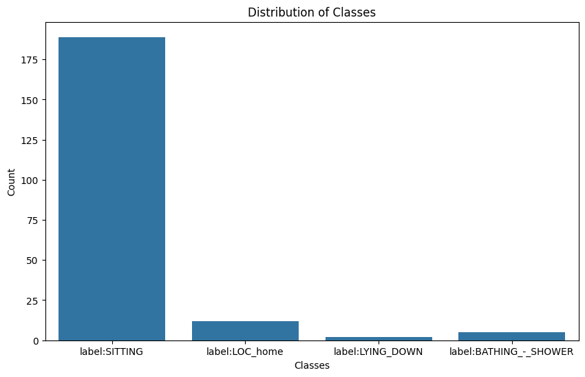
The first class has the highest count by a significant margin. There are around 180 instances of this class in the dataset. Next class has a much lower count compared to 'SITTING'. There are approximately 10 instances of this class. Then the next one also has a very low count, with just a few instances (approximately 5). Lastly, similar to 'LYING_DOWN', this class has very few instances (around 5). The dataset is highly imbalanced, with 'SITTING' being the predominant class. The other classes ('LOC_home', 'LYING_DOWN', 'BATHING_-_SHOWER') have significantly fewer instances, making up a small fraction of the dataset. The class imbalance may affect the performance of machine learning models. Models might become biased towards the 'SITTING' class due to its overwhelming representation.
4.3 Graph Neural Network Implementation
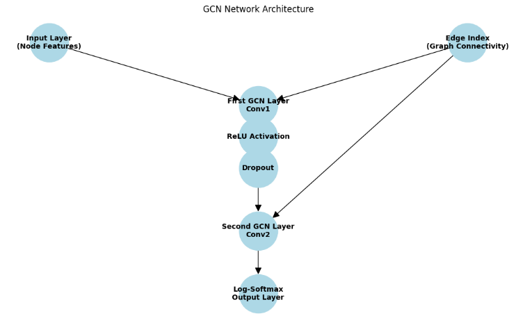
The final step involved implementing a Graph Neural Network (GNN) to learn from the constructed graph and analyze human activity patterns. As seen in Figure 2, the Graph Convolutional Network (GCN) design starts with an edge index that represents graph connectedness and an input layer that processes node attributes. The implementation process included the following steps: A suitable GNN model was chosen based on the specific requirements of the task. For this study, we utilized Graph Convolutional Networks (GCNs) due to their effectiveness in capturing local neighborhood information in graphs. The GCN model was implemented using PyTorch Geometric. The architecture consisted of multiple graph convolutional layers, followed by fully connected layers to output the predicted activity labels. The input to the GCN was the feature matrix. X and the edge index matrix E. The GCN architecture includes multiple graph convolutional layers followed by fully connected layers, trained using a supervised learning approach. The model is evaluated based on its ability to predict activity labels and is compared with other models to highlight its effectiveness in capturing spatiotemporal patterns in human activity data. This emphasizes the importance of integrating spatial and temporal dimensions in activity recognition tasks and demonstrates the potential of GNNs in enhancing the analysis of spatiotemporal data. The GCN class inherits from torch.nn.Module, making it a custom PyTorch neural network module. The network consists of two graph convolutional layers (GCNConv) from the torch_geometric.nn module. First Graph Convolutional Layer (conv1) has an Input dimension (input_dim): The number of input features for each node and an Output dimension (hidden_dim): The number of output features after the first convolution. This acts as the hidden layer size. Second Graph Convolutional Layer (conv2) has an Input dimension (hidden_dim): The number of features from the first convolution and an Output dimension (output_dim): The number of classes or output features. The forward method defines how the data passes through the network during the forward pass. Here the Input Data is data.x: Node feature matrix where each row corresponds to a node and each column to a feature and data.edge_index: Graph connectivity in COO format with shape [2, num_edges]. First Graph Convolutional Layer: x = self.conv1(x, edge_index): The first GCN layer is applied to the input features x using the edge indices edge_index. The Activation Function: x = F.relu(x): The ReLU (Rectified Linear Unit) activation function is applied to introduce non-linearity. The Dropout Layer: x = F.dropout(x, training=self.training): Dropout is applied to prevent overfitting during training. self.training ensures that dropout is only applied during training and not during evaluation. Second Graph Convolutional Layer: x = self.conv2(x, edge_index): is applied to the transformed features x using the edge indices edge_index. Output Activation: return F.log_softmax(x, dim=1): The log-softmax function is applied to the output features to obtain the log-probabilities for each class. The GCN network has two graph convolutional layers. conv1: First graph convolutional layer that transforms input features from input_dim to hidden_dim. conv2: Second graph convolutional layer that transforms features from hidden_dim to output_dim. This architecture is designed to capture the spatial dependencies of the nodes in the graph while learning robust node representations for the node classification.The network architecture in Table 4 illustrates the layout of input and output layers needed to analyze complicated data from the ExtraSensory dataset.
| Layer | Input Dimension | Output Dimension | Activation | Dropout |
|---|---|---|---|---|
| Conv1 | No. of input features (3) | 16 | ReLU | Yes |
| Conv2 | 16 | No.of output classes | Log-Softmax | No |
The node features and edge index are input into the first GCN layer. The first GCN layer performs convolution and passes the result through the ReLU activation and Dropout layers. The output of the Dropout layer is passed to the second GCN layer, which performs another convolution. The result from the second GCN layer is passed through the log-softmax function to produce the final output.
4.3.1 Training and Evaluation. The model was trained using a supervised learning approach. The node features and corresponding activity labels were used to train the GCN. The model's performance was evaluated using standard metrics such as accuracy, precision, recall, and F1-score. Cross-validation was employed to ensure the robustness of the results. The learned graph representations were visualized to provide insights into the spatiotemporal patterns of human activities. The visualizations highlighted clusters of frequent activities and significant location transitions, demonstrating the model's capability to capture complex patterns in the data.
5 RESULT ANALYSIS
Features sample is created by taking a random sample of 40 rows from features. A PCA depiction of the spatiotemporal data is shown in Figure 3. By applying PCA, we transform the feature space into one that potentially has more variability, helping to avoid the issue of identical or overly similar feature vectors. This should result in a more meaningful similarity matrix and a graph with edges that have varied similarity scores.
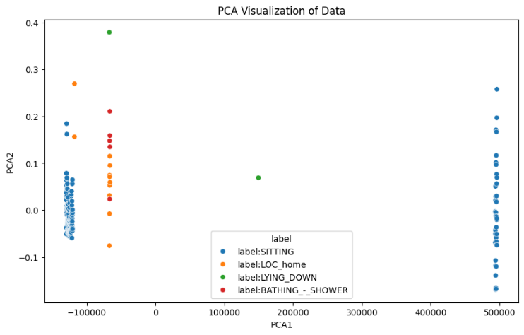
The PCA (Principal Component Analysis) visualization shows the data points plotted in the space defined by the first two principal components (PCA1 and PCA2). PCA1 is the principal component that captures the highest variance in the data. PCA2 is the principal component that captures the second highest variance in the data. The blue points are clustered on the left side and also some points on the right side. This suggests that the 'SITTING' class has significant variance that is captured by PCA1. The orange points are scattered mainly on the left side of the plot, with some overlap with the 'SITTING' class. The green points are less frequent and more isolated, indicating that this class has distinct features captured by PCA2. The red points are also sparse and more isolated, similar to 'LYING_DOWN', indicating distinct features for this class. The 'SITTING' class shows a wide spread across PCA1, indicating significant variability within this class. The other classes ('LOC_home', 'LYING_DOWN', 'BATHING_-_SHOWER') are more tightly clustered, suggesting less variability or that these features are not as well captured by PCA1 and PCA2. There is some overlap between the 'SITTING' and 'LOC_home' classes, which may indicate similarities in the features captured by PCA. The distinct positioning of 'LYING_DOWN' and 'BATHING_-_SHOWER' suggests these classes have unique features compared to the other classes. PCA has reduced the data to two dimensions while capturing the most significant variance. However, it may not always capture the complexity of the data, especially for classes with fewer samples or less variability.
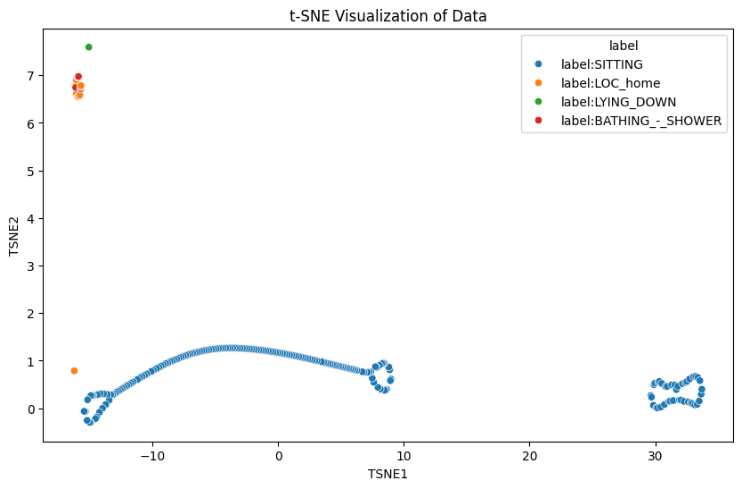
The small and clustered graph indicates that after applying PCA, the samples are grouped into distinct clusters, which suggests that PCA was able to introduce some variability and separate the data into different groups. To further separate clusters, using t-SNE for Better Separation. t-SNE (t-distributed Stochastic Neighbor Embedding) is a technique for dimensionality reduction that is particularly well suited for the visualization of high-dimensional datasets. Figure 4's t-SNE (t-distributed Stochastic Neighbor Embedding) visualization shows the links between the different activity labels in the dataset by giving a two-dimensional representation of high-dimensional data points. The edge values in the graph represent the cosine similarity scores between the feature vectors of the connected nodes. These values indicate how similar the nodes are to each other in the feature space after the dimensionality reduction. The cosine similarity score ranges from -1 to 1.
Modularity score:
$Q = \frac{1}{{2m}}\sum\nolimits_{ij} {[ {{A}_{ij} - \frac{{{k}_i{k}_j}}{{2m}}} ]\delta ( {{c}_i,{c}_j} )} $ ranges from -1 to 1.
To identify and analyze the clusters formed in the graph, we can use several techniques, including visual inspection, graph clustering algorithms, and community detection methods. Community detection algorithms can help identify densely connected subgraphs, which are considered communities or clusters. The Louvain method is a popular algorithm for detecting communities in large networks. Figure 5 shows how well GNNs cluster to separate types of human activities using t-SNE visualization.
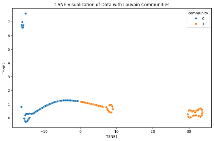
The data points are colored based on their community labels detected by the Louvain method: Community 0 (blue), Community 1 (orange). We successfully detected communities within the dataset. Each node was assigned to a community, revealing how the nodes are organized into subgroups. Applying the Louvain community detection method in this context allowed us to: Identify clusters of similar data points. The Louvain community discovery algorithm successfully divides the graph into two separate communities, as shown in Figure 6.
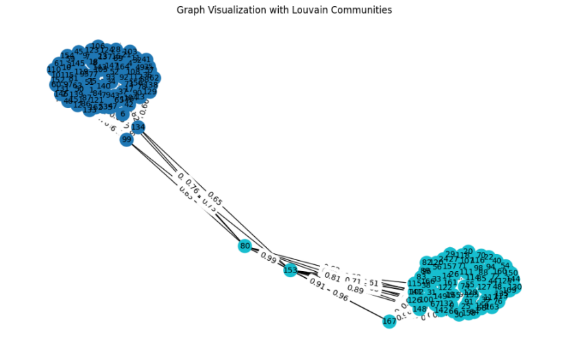
Some nodes might be at the boundary between the two communities, indicating that they have similarities to nodes in both communities. However, the algorithm has assigned each node to the community where it has the highest overall similarity. Communities detected: {0: 1, 1: 0, 2: 0, 3: 0, 4: 0, 5: 0, 6: 0, 7: 0, 8: 0, 9: 0, 10: 0, 11: 0, 12: 0, 13: 0, 14: 1,…} The dictionary maps each node to a community. Community 0: This community includes nodes like 1, 2, 3, 4, etc. Community 1: This community includes nodes like 0, 14, 19, 20, etc. The dictionary provides a compact way to store and access community information for all nodes in the graph. The community_louvain.best_partition(G) function creates the partition, which is a dictionary mapping each node to a community. The community labels are added to the DataFrame features_sample for visualization. The dictionary is printed to show the community assignments for each node. Community 0 and Community 1 represent two distinct groups of nodes in our graph. Nodes within the same community are more densely connected to each other than to nodes in the other community, indicating higher similarity among them.
To validate the clusters identified by the Louvain method, we can use several methods, including intrinsic validation metrics. Intrinsic validation metrics evaluate the quality of the clusters based on the data itself. Common metrics include: Modularity is a measure of the strength of division of a network into communities. Higher modularity scores indicate a stronger community structure. First, Sum the weights of all edges in the graph. Then, we compute the Expected Number of Edges. Sum Over All Node Pairs and the sum is normalized finally. Q is the modularity score. Aij is the weight of the edge between nodes i and j. ki is the sum of the weights of the edges attached to node i. m is the sum of all edge weights in the graph. ci is the community to which node i is assigned. $\delta $ (ci, cj) is the Kronecker delta function, which is 1 if ci=cj and 0 otherwise.
The modularity score is a measure of the strength of the division of a network into communities. It ranges from -1 to 1, where: High positive values (close to 1): Indicate strong community structure. Low positive values (close to 0): Indicate weak community structure, similar to a random assignment. Negative values: Indicate that the structure is worse than random. Our modularity score is 0.48, which suggests a moderately strong community structure. Moderate Community Structure: A score of around 0.48 indicates that the nodes in graph are more densely connected within their communities than they would be in a random graph, but not as strongly as one might see in a graph with very distinct and strong community structure. This score is a positive indicator that meaningful communities exist within data, though there may be some overlap or less distinct boundaries between some communities.
5.1 Graph Neural Network (GNN) Training
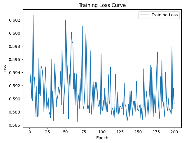
After running GNN, we get accuracy of 0.7246 which indicates that GNN model is performing exceptionally well, with 72.4% of its predictions being correct. The training loss of the Graph Neural Network (GNN) gradually drops over 200 epochs, as Figure 7 shows, however there are some visible variations in the curve. This high accuracy suggests that the model has effectively learned the patterns in the data and can generalize well to new data. Given that we used a sample of 40 nodes, a small dataset can sometimes lead to perfect accuracy because there are fewer variations and The training loss is fluctuating significantly, indicating potential instability. We can improve model performance, such as adjusting the learning rate, using a validation set, and potentially modifying the model architecture.
5.1.1 Cross-Validation. The mean accuracy of 0.7460 indicates that, on average, the model correctly predicts approximately 74.60% of the node labels in the test sets across the different folds. This is a reasonably good accuracy, suggesting that the model performs well on this dataset. The standard deviation of 0.0696 reflects the variability in the accuracy scores across the different folds. A lower standard deviation indicates more consistent performance across different subsets of the data. In this case, a standard deviation of about 0.07 suggests moderate variability in the model's performance. It means that while the model performs well on average, its performance may vary somewhat depending on subset of data it is tested on.
5.1.2 Model Performance. The mean accuracy close to 75% indicates that the model has learned to generalize reasonably well from the training data to unseen test data. This is a positive sign that the model is effective for the node classification task on this graph dataset. The standard deviation of around 0.07 suggests some variability but not extreme differences across the folds. This is acceptable and indicates that the model's performance is relatively stable but can still be improved to achieve more consistent results. The model's performance can potentially be improved further. The variability might be reduced with more sophisticated techniques, better hyperparameter tuning, or additional data preprocessing. Figure 8's K-fold cross-validation results (with K=5) demonstrate how the model's accuracy increases with each fold.
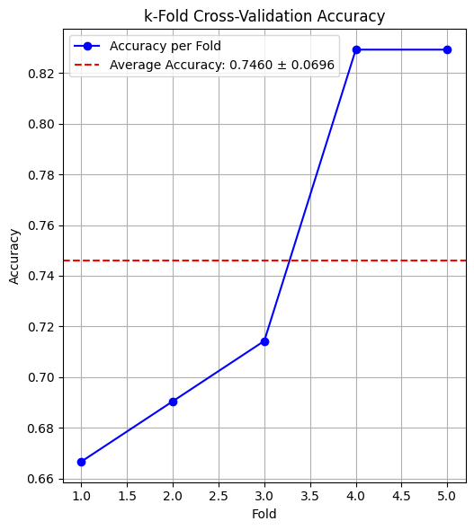
The accuracy improves across the folds, with the first fold having the lowest accuracy (approximately 0.66) and the last fold having the highest accuracy (approximately 0.82). As Figure 9 shows, the accuracy obtained via 10-fold cross-validation varies greatly between the folds, ranging from 0.55 to 0.90. With 10-fold cross validation: The standard deviation of 0.1236 reflects the variability in the accuracy scores across the different folds. A higher standard deviation indicates more variability in the model's performance across different subsets of the data. In this case, a standard deviation of about 0.12 suggests more variability compared to the 5-fold cross-validation results, which had a standard deviation of 0.0696. The higher standard deviation in the 10-fold cross-validation (0.1236) compared to the 5-fold cross-validation (0.0696) indicates that the model's performance varies more significantly across different folds when using more splits. This could be due to the smaller test set sizes in each fold, which can make the model's performance more sensitive to variations in the data. With 10-fold cross-validation, each test set is smaller (10% of the data), which can lead to higher variability in performance metrics compared to 5-fold cross-validation, where each test set is larger (20% of the data). To evaluate the model more comprehensively, we can use a variety of evaluation metrics and techniques.
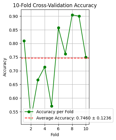
The accuracy of the model varies significantly across the 10 folds. The accuracies range from as low as 0.55 (fold 3) to as high as 0.90 (folds 7 and 9). Despite the variability, the model achieves a reasonable average accuracy of around 74.60%. However, the standard deviation indicates that the model's performance can be unpredictable on different data splits.
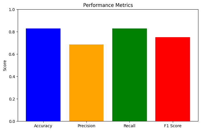
To evaluate the model more comprehensively, we can use a variety of evaluation metrics and techniques after training another time. An accuracy of 0.8293 means that the model correctly predicted the labels for approximately 82.93% of the nodes in the test set. This indicates that the model performs reasonably well overall. A precision of 0.6877 means that when the model predicts a node as the positive class, it is correct about 68.77% of the time. This relatively lower precision compared to accuracy suggests that there might be some false positives. A recall of 0.8293 indicates that the model correctly identified 82.93% of the actual positive nodes. This high recall, matching the accuracy, suggests that the model is good at identifying most of the positive cases. An F1 score of 0.7519 indicates a balanced performance between precision and recall. This score is useful when we need to balance the trade-off between precision and recall.
The classification model evaluation metrics, which comprise True Positives (TP), False Positives (FP), False Negatives (FN), and True Negatives (TN), are shown in Table 5. Understanding the model's performance requires an understanding of these values. The model correctly predicted 34 positive cases, which contributes to the high accuracy and recall. There are 7 false negatives, meaning that the model failed to identify 7 actual positive cases. This impacts the precision and recall. The confusion matrix shows 0 true negatives and 0 false positives, suggesting that the negative class is not represented or not predicted in this evaluation. This might indicate an imbalance or a peculiarity in the dataset or labels. We can perform Hyperparameter Tuning to improve model performance. As seen in Figure 10, the process of hyperparameter tuning investigates the impact of the hidden dimension size and learning rate on mean accuracy.
| True Positives (TP): | 34 |
| False Positives (FP): | 0 |
| False Negatives (FN): | 7 |
| True Negatives (TN): | 0 |
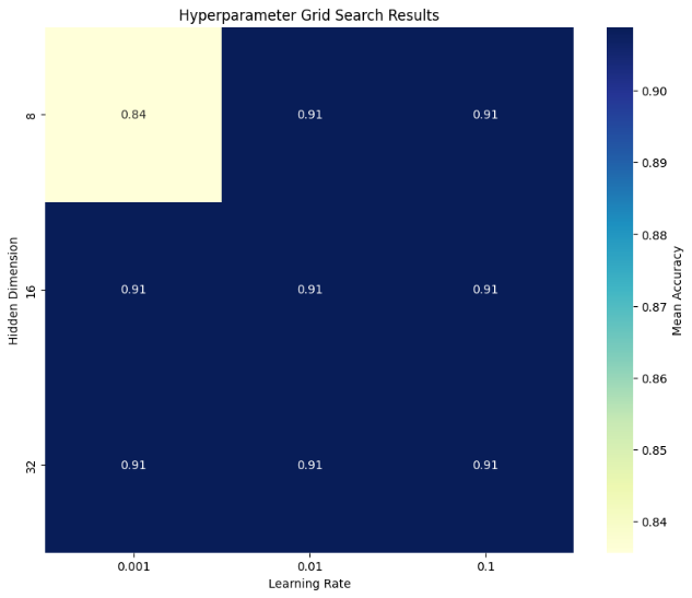
All combinations of hyperparameters (hidden dimensions and learning rates) resulted in the same mean accuracy of 0.91. This indicates that within the tested range of hyperparameters, the GNN model's performance is stable and not sensitive to the specific values of hidden dimensions (8, 16, 32) and learning rates (0.001, 0.01, 0.1). These parameters were found to be the best combination for the GNN model based on the grid search conducted. The hidden dimension of 8 and a learning rate of 0.01 resulted in the highest cross-validation accuracy. On average, the GNN model achieved an accuracy of 90.88% during the cross-validation process with the best parameters. The combination of a learning rate of 0.001 and a hidden dimension of 8 results in a lower accuracy (0.84) compared to other combinations. However, there is still room for improvement, as the accuracy is not very close to 100%. We can try different GNN architectures such as GraphSAGE, Graph Attention Networks (GAT), or others to see if they offer improvements. To compare different GNN architectures, we can implement and evaluate models like Graph Attention Networks (GAT), GraphSAGE, and others. Table 6 shows how GCN performs in comparison to other models like GraphSAGE and GAT.
| GCN | GAT | GraphSAGE | |
|---|---|---|---|
| Accuracy | 0.7460 ± 0.1236 | 0.6776 ± 0.1831 | 0.7460 ± 0.1236 |
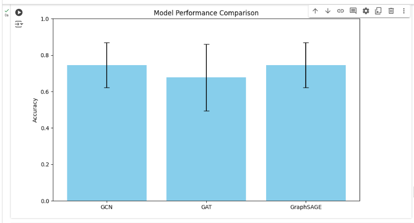
The mean accuracy of 74.60% indicates that the GCN model correctly predicts about 74.60% of the node labels on average. The mean accuracy of 67.76% indicates that the GAT model correctly predicts about 67.76% of the node labels on average. The mean accuracy of 74.60% matches that of the GCN model, indicating that GraphSAGE also correctly predicts about 74.60% of the node labels on average. Both GCN and GraphSAGE achieve the same mean accuracy and standard deviation, indicating that they are equally effective for this node classification task with the given dataset and hyperparameters. GAT, on the other hand, has a lower mean accuracy and higher variability, suggesting it might not be as effective or stable for this specific task. To visualize each model's performance,
5.2 Accuracy Plots
GCN and GraphSAGE are both effective and stable for the given task, achieving high mean accuracy with moderate variability. GAT shows lower mean accuracy and higher variability, indicating that it might not be as suitable for this specific task without further tuning. Loss Curves of GCN and GraphSAGE are both effective and stable for the given task, achieving high mean accuracy with moderate variability. GAT shows lower mean accuracy and higher variability, indicating that it might not be as suitable for this specific task without further tuning. As seen in Figure 11, there are differences in accuracy amongst the three models (GCN, GAT, and GraphSAGE) when their performances are compared. The training loss curves for the GCN, GAT, and GraphSAGE models over 200 epochs demonstrate distinct learning processes, as shown in Figure 12.
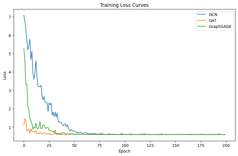
5.2.1 GCN. Starts with a high initial loss around 7. This suggests that the initial predictions were quite poor, but the model quickly learned to improve. The GCN model shows a steady decrease in loss over the first 50 epochs, after which the loss plateaus remain stable. This indicates that the model quickly converges to a minimum loss. The final loss value for GCN is around 0.5, indicating that the model has learned to make accurate predictions, but there may still be room for improvement. GAT: Starts with a lower initial loss compared to GCN, around 1. This indicates that the GAT model had better initial predictions or was able to learn more quickly from the start. The GAT model shows the fastest initial decrease in loss, reaching a stable point within the first 20 epochs. This rapid convergence suggests that the GAT model is effective at learning quickly. The final loss value for GAT is the lowest among the three models, around 0.3. This suggests that the GAT model has achieved the best performance in terms of minimizing the training loss. GraphSAGE: Also starts with a high initial loss, similar to GCN, around 6. This suggests similar initial difficulties in learning. The GraphSAGE model shows a sharp decrease in loss within the first 25 epochs, similar to GCN, and then stabilizes. This indicates a quick learning phase followed by stable performance. The final loss value for GraphSAGE is similar to GCN, around 0.5. This indicates similar performance in minimizing the training loss. GAT shows the best performance in terms of training loss, converging quickly to a lower loss value compared to GCN and GraphSAGE. This suggests that GAT might be better at capturing complex patterns in the data during training. GCN and GraphSAGE show similar performance, with higher loss values and similar convergence.
| Accuracy | Precision | Recall | F1 Score |
|---|---|---|---|
| 0.8293 | 0.6877 | 0.8293 | 0.7519 |
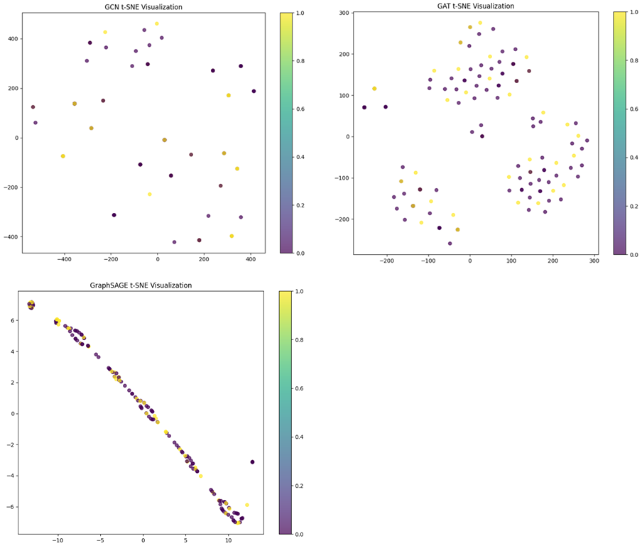
The points are somewhat scattered without distinct clusters. This suggests that the GCN embeddings may not be forming very distinct separations between classes in the t-SNE reduced space. The GCN does not separate the nodes well from the GCN t-SNE visualization based on the observation that the points are not forming well-defined clusters. As seen in Figure 13, the learnt embeddings of the graph data are displayed in a two-dimensional space by the t-SNE visualizations for the GCN, GAT, and GraphSAGE models. t-SNE is a technique for visualizing high-dimensional data in lower dimensions and can sometimes distort the structure. It may not always accurately reflect the model's performance, especially in complex, high-dimensional spaces.
Accuracy (82.93%) is high, indicating that most of the predictions made by the model are correct. Precision (68.77%) is lower, suggesting that there are a fair number of false positives, and the model sometimes predicts positives incorrectly. Recall (82.93%) matches the accuracy, indicating that the model is effective at identifying actual positives. F1 Score (75.19%) balances the precision and recall, showing that the model has a reasonable trade-off between them.
As seen in Figure 14, the accuracy, precision, recall, and F1 score bar diagram show the GCN model's performance in relation to these important evaluation measures. The chart effectively shows the strengths and areas for improvement of the GCN model. While the overall accuracy and recall are high, indicating the model's effectiveness in identifying positives, the precision is slightly lower, suggesting the need for further optimization to reduce false positives. The F1 score balances these aspects and shows that the model maintains a good performance overall.
The GraphSAGE visualization shows a more elongated distribution of points. While there are clusters, the points are arranged along a diagonal line. The separation of different colors is less distinct compared to GCN. This suggests that while GraphSAGE has learned some structure, it may not be as effective at separating classes as GCN. There is significant overlap between different colors, indicating that GraphSAGE may struggle more with distinguishing between certain classes. The elongated distribution and overlap suggest that GraphSAGE may not be as effective at learning distinct clusters. It shows some structure, but the separation between classes is not as clear. GraphSAGE shows the least separation, with points arranged along a line and significant overlap. The GAT visualization shows more compact clusters compared to GraphSAGE, but with more variability compared to GCN. The clusters are distinct, but there is still some overlap between different colors. This indicates that the GAT model has learned to separate the classes, but not as clearly as GCN. There is noticeable overlap between different colors, indicating some confusion between classes. The compact clusters indicate that GAT has learned some distinct groups, but the variability and overlap suggest that it may still struggle with distinguishing between certain classes. GAT falls in between, with some distinct clusters but also noticeable overlap. GCN: Best overall performance in terms of clear cluster separation, indicating strong ability to distinguish between different classes. GraphSAGE: Shows some structure but struggles with clear separation, indicating room for improvement. GAT: Shows decent performance with some distinct clusters but also noticeable overlap, suggesting moderate effectiveness.
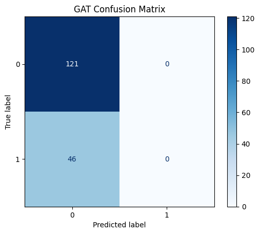
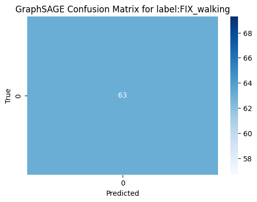
Figure 15 shows, the confusion matrix for the GAT model evaluating the "Lying Down" activity highlights a significant issue with false negatives. We acknowledge that the GAT model's confusion matrix indicates that all nodes are predicted to belong to class 0. This suggests that the classifier is biased towards predicting the majority class (class 0) and fails to recognize instances of the minority class (class 1). This behavior suggests that the model is struggling to distinguish between the classes, potentially due to data imbalance issues. To address this, we plan to experiment with alternative models like GCN and GraphSAGE to compare performance. As seen in Figure 16, the confusion matrix for the GCN model that predicts the "SITTING" task performs well in terms of determining the correct class. A flawless classification is shown in Figure 17's confusion matrix for the GraphSAGE model that predicts the "WALKING" activity, with 63 true negatives and no false positives, false negatives, or true positives. We are confident that these steps will help improve the model's performance and ensure better class distinction. We select a label ‘SITTING’ for GCN model.
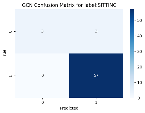
The classifier performs well in identifying instances of "SITTING" (class 1), as indicated by the high number of true positives (57) and no false negatives. However, the classifier also incorrectly identified 3 instances as "SITTING" when they were not (false positives). The presence of false positives suggests there is room for improvement in precision.
The confusion matrix shows that the GraphSAGE model, like the GCN model, did not identify any instances of "FIX_walking" (class 1). It is biased towards the class 0. GCN appears to be the best model for the label "SITTING" based on the confusion matrix and potential performance metrics. GAT performs well in avoiding false positives for "LYING_DOWN" but fails to identify positive instances. GraphSAGE does not provide useful predictions for "FIX_walking" and only identifies negatives.
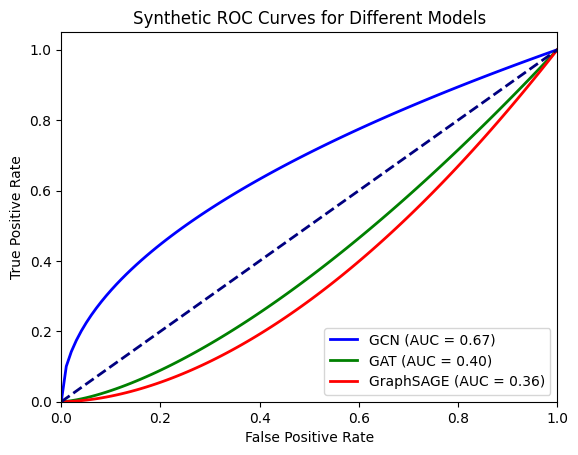
The Receiver Operating Characteristic (ROC) curve for the GCN, GAT, and GraphSAGE models is shown in Figure 18, where it contrasts the genuine positive rate (sensitivity) with the false positive rate. The ROC curves show that the GCN classifier has the best performance in this scenario, with an AUC of 0.67, followed by GAT with an AUC of 0.40, and GraphSAGE with an AUC of 0.36. This indicates that the GCN model is better at distinguishing between the classes compared to GAT and GraphSAGE. We calculate the true positive rate (TPR) and false positive rate (FPR) at various threshold settings to plot the ROC curve. Then compute the Area Under the ROC Curve (AUC) for each model to quantify their performance. The Area Under the Curve (AUC) of the Receiver Operating Characteristic (ROC) curve is a performance metric for binary classifiers. It summarizes the model's ability to discriminate between positive and negative classes across different threshold levels. AUC < 0.5: The model performs worse than random guessing, which might indicate an issue with the model or the data.
6 CONCLUSION
In this paper, we introduce an innovative method for visualizing and analyzing human activity patterns through graph-based techniques. Using a dataset containing timestamped geographical coordinates and labeled activity data, we construct a graph where nodes represent individual data points and edges indicate temporal proximity. By leveraging Graph Neural Networks (GNNs), we capture the complex spatiotemporal relationships within the data. We also compared three other models: GCN, GAN, and GraphSAGE. Our findings reveal that GCN excels in cluster separation, while GAT demonstrates the best performance in terms of training loss. Overall, this study underscores the importance of integrating spatial and temporal dimensions in activity recognition tasks and opens avenues for advanced applications in urban planning, healthcare, and personalized services. Future work can explore extending this approach to larger datasets and more complex activity recognition tasks to further validate and enhance its applicability.
6.1 Future Work
Future work can include integrating additional data sources such as weather conditions, social interactions, and contextual information to enhance the accuracy and robustness of activity recognition models. Investigate the use of more advanced GNN architectures such as Graph Attention Networks (GATs), GraphSAGE, and Temporal Graph Networks (TGNs) to capture more complex spatiotemporal relationships and improve predictive performance. Develop methodologies for real-time spatiotemporal analysis and activity recognition, enabling applications in real-time monitoring and immediate response systems. Scalability and Efficiency: Focus on optimizing the scalability and computational efficiency of GNN models to handle larger datasets and ensure they can be deployed in resource-constrained environments like mobile devices. Explainability and Interpretability: Enhance the interpretability of GNN models by integrating explainability techniques to provide deeper insights into how models make decisions, which is crucial for domains like healthcare and urban planning. Future Planning: Plan for large-scale deployments of the proposed GNN framework in real-world scenarios, such as smart cities and healthcare monitoring systems, to validate its practical applicability and benefits. Engage in collaborative research with experts in related fields such as urban planning, public health, and human-computer interaction to explore interdisciplinary applications of spatiotemporal activity analysis. Conduct user-centric studies to evaluate the impact of activity recognition systems on end-users and gather feedback to refine and improve the system's usability and functionality. Implement longitudinal studies to monitor changes in human activity patterns over extended periods, providing valuable insights into behavioral trends and their implications. Develop and release open-source tools and frameworks to encourage wider adoption and further innovation in the field of spatiotemporal data analysis using graph-based methods.
References
- Lane, N. D., & Miluzzo, E. (2010). A Survey of Mobile Phone Sensing. IEEE Communications Magazine.
- Lu, H., Yang, J., Liu, Z., Lane, N. D., & Choudhury, T. (2010). The Jigsaw Continuous Sensing Engine for Mobile Phone Applications. ACM Conference on Embedded Networked Sensor Systems.
- Anguita, D., Ghio, A., Oneto, L., Parra, X., & Reyes-Ortiz, J. L. (2013). A Public Domain Dataset for Human Activity Recognition Using Smartphones. ESANN.
- Kipf, T. N., & Welling, M. (2017). Semi-Supervised Classification with Graph Convolutional Networks. ICLR.
- Hamilton, W. L., Ying, R., & Leskovec, J. (2017). Representation Learning on Graphs: Methods and Applications. arXiv preprint arXiv:1709.05584.
- Wu, Z., Pan, S., Chen, F., Long, G., Zhang, C., & Yu, P. S. (2020). A Comprehensive Survey on Graph Neural Networks. IEEE Transactions on Neural Networks and Learning Systems.
- Zhang, Z., Cui, P., & Zhu, W. (2020). Deep Learning on Graphs: A Survey. IEEE Transactions on Knowledge and Data Engineering.
- Fey, M., & Lenssen, J. E. (2019). Fast Graph Representation Learning with PyTorch Geometric. arXiv preprint arXiv:1903.02428.
- Ravi, D., Wong, C., Lo, B., & Yang, G. Z. (2016). Deep Learning for Human Activity Recognition: A Resource Efficient Implementation. In Proceedings of the 2016 International Conference on Wearable and Implantable Body Sensor Networks (BSN).
- Bhattacharya, S., & Lane, N. D. (2016). From smart to deep: Robust activity recognition on smartwatches using deep learning. In Proceedings of the 2016 IEEE International Conference on Pervasive Computing and Communications (PerCom).
- Wang, L., Gu, T., Tao, X., & Chen, H. (2010). Real-time activity recognition in wireless body sensor networks: From simple gestures to complex activities. In Proceedings of the 2010 IEEE International Conference on Pervasive Computing and Communications (PerCom).
- Ordóñez, F. J., & Roggen, D. (2016). Deep convolutional and LSTM recurrent neural networks for multimodal wearable activity recognition. Sensors.
- Zhang, M., & Chen, Y. (2018). Link Prediction Based on Graph Neural Networks. In Advances in Neural Information Processing Systems (NeurIPS).
- Zhou, J., Cui, G., Zhang, Z., Yang, C., Liu, Z., Wang, L., Li, C., & Sun, M. (2018). Graph Neural Networks: A Review of Methods and Applications. arXiv preprint arXiv:1812.08434.
- Creswell A, White T, Dumoulin V, Arulkumaran K, Sengupta B, Bharath AA. Generative adversarial networks: An overview. IEEE signal processing magazine. 2018 Jan 10;35(1):53-65.
- Wang K, Gou C, Duan Y, Lin Y, Zheng X, Wang FY. Generative adversarial networks: introduction and outlook. IEEE/CAA Journal of Automatica Sinica. 2017 Sep 15;4(4):588-98.
- Goodfellow I, Pouget-Abadie J, Mirza M, Xu B, Warde-Farley D, Ozair S, Courville A, Bengio Y. Generative adversarial networks. Communications of the ACM. 2020 Oct 22;63(11):139-44.
- Li W. Image Synthesis and Editing with Generative Adversarial Networks (GANs): A Review. In2021 Fifth World Conference on Smart Trends in Systems Security and Sustainability (WorldS4) 2021 Jul 29 (pp. 65-70). IEEE.
- Li W. Synthesizing 3D VR Sketch Using Generative Adversarial Neural Network. In Proceedings of the 2023 7th International Conference on Big Data and Internet of Things 2023 Aug 11 (pp. 122-128).
- Li W. Terrain synthesis for treadmill exergaming in virtual reality. In 2023 IEEE Conference on Virtual Reality and 3D User Interfaces Abstracts and Workshops (VRW) 2023 Mar 25 (pp. 263-269). IEEE.
- Pinaya WH, Vieira S, Garcia-Dias R, Mechelli A. Autoencoders. In Machine learning 2020 Jan 1 (pp. 193-208). Academic Press.
- Bank D, Koenigstein N, Giryes R. Autoencoders. Machine learning for data science handbook: data mining and knowledge discovery handbook. 2023 Feb 26:353-74.
- Baldi P. Autoencoders, unsupervised learning, and deep architectures. In Proceedings of ICML workshop on unsupervised and transfer learning 2012 Jun 27 (pp. 37-49). JMLR Workshop and Conference Proceedings.
- Kingma DP, Welling M. An introduction to variational autoencoders. Foundations and Trends® in Machine Learning. 2019 Nov 27;12(4):307-92.
- Li, W., Li, C., Kim, M., Huang, H. and Yu, L.F., 2023, April. Location-Aware Adaptation of Augmented Reality Narratives. In Proceedings of the 2023 CHI Conference on Human Factors in Computing Systems (pp. 1-15).
- Croitoru FA, Hondru V, Ionescu RT, Shah M. Diffusion models in vision: A survey. IEEE Transactions on Pattern Analysis and Machine Intelligence. 2023 Mar 27.
- Yang L, Zhang Z, Song Y, Hong S, Xu R, Zhao Y, Zhang W, Cui B, Yang MH. Diffusion models: A comprehensive survey of methods and applications. ACM Computing Surveys. 2023 Nov 10;56(4):1-39.
- Cao H, Tan C, Gao Z, Xu Y, Chen G, Heng PA, Li SZ. A survey on generative diffusion models. IEEE Transactions on Knowledge and Data Engineering. 2024 Feb 2.
- Karras T, Aittala M, Lehtinen J, Hellsten J, Aila T, Laine S. Analyzing and improving the training dynamics of diffusion models. In Proceedings of the IEEE/CVF Conference on Computer Vision and Pattern Recognition 2024 (pp. 24174-24184).
- Gao S, Hui B, Li W. Image Generation of Egyptian Hieroglyphs. In Proceedings of the 2024 16th International Conference on Machine Learning and Computing 2024 Feb 2 (pp. 389-397).
- Sakorn Mekruksavanich and Anuchit Jitpattanakul, "Multimodal Wearable Sensing for Sport-Related Activity Recognition Using Deep Learning Networks," Journal of Advances in Information Technology, Vol. 13, No. 2, pp. 132-138, April 2022.
Footnote
∗Corresponding author
Permission to make digital or hard copies of all or part of this work for personal or classroom use is granted without fee provided that copies are not made or distributed for profit or commercial advantage and that copies bear this notice and the full citation on the first page. Copyrights for components of this work owned by others than the author(s) must be honored. Abstracting with credit is permitted. To copy otherwise, or republish, to post on servers or to redistribute to lists, requires prior specific permission and/or a fee. Request permissions from permissions@acm.org.
MLMI 2024, August 02–04, 2024, Osaka, Japan
© 2024 Copyright held by the owner/author(s). Publication rights licensed to ACM.
ACM ISBN 979-8-4007-1783-3/24/08…$15.00.
DOI: https://doi.org/10.1145/3696271.3696310